
The Golden Ratio Rule for the Best 2D Sketch
How proportion drives every plan we draw, before a single wall moves.
Why the plan decides everything
Every interior problem that cannot be fixed later was created in the 2D plan. Furnishing cannot rescue a room whose proportions are wrong, and no amount of lighting fixes a circulation route that cuts through the middle of a seating group. This is why we spend a disproportionate amount of a project on drawings that look, to a client, like the least exciting deliverable.
The plan is also the cheapest place to make mistakes. Moving a line on a drawing costs nothing. Moving it on site costs a fortnight.
What the golden ratio actually is
The golden ratio is roughly 1 to 1.618 — a proportion where the relationship between the smaller part and the larger is the same as the relationship between the larger and the whole. It appears throughout classical architecture and, whether or not you find the mathematics interesting, it produces proportions most people read as settled rather than arbitrary.
For practical purposes we treat it as a starting reference rather than a law. A room close to 1:1.6 tends to feel resolved. A room at 1:1 can feel static, and one much beyond 1:2 starts to read as a corridor unless it is deliberately zoned into two.
Using ratio to size a room
Where we can influence room dimensions — a wall being moved, an open plan being divided — proportion is the first test. A living space at roughly 1:1.6 gives you a natural primary axis to arrange furniture along, which makes every subsequent decision easier.
Where the shell is fixed, which is most of the time, the same idea applies to the zones inside a room rather than the room itself. A long living-dining space can be split into two areas whose proportions are individually comfortable, even though the overall room is not.
Proportion between furniture and floor
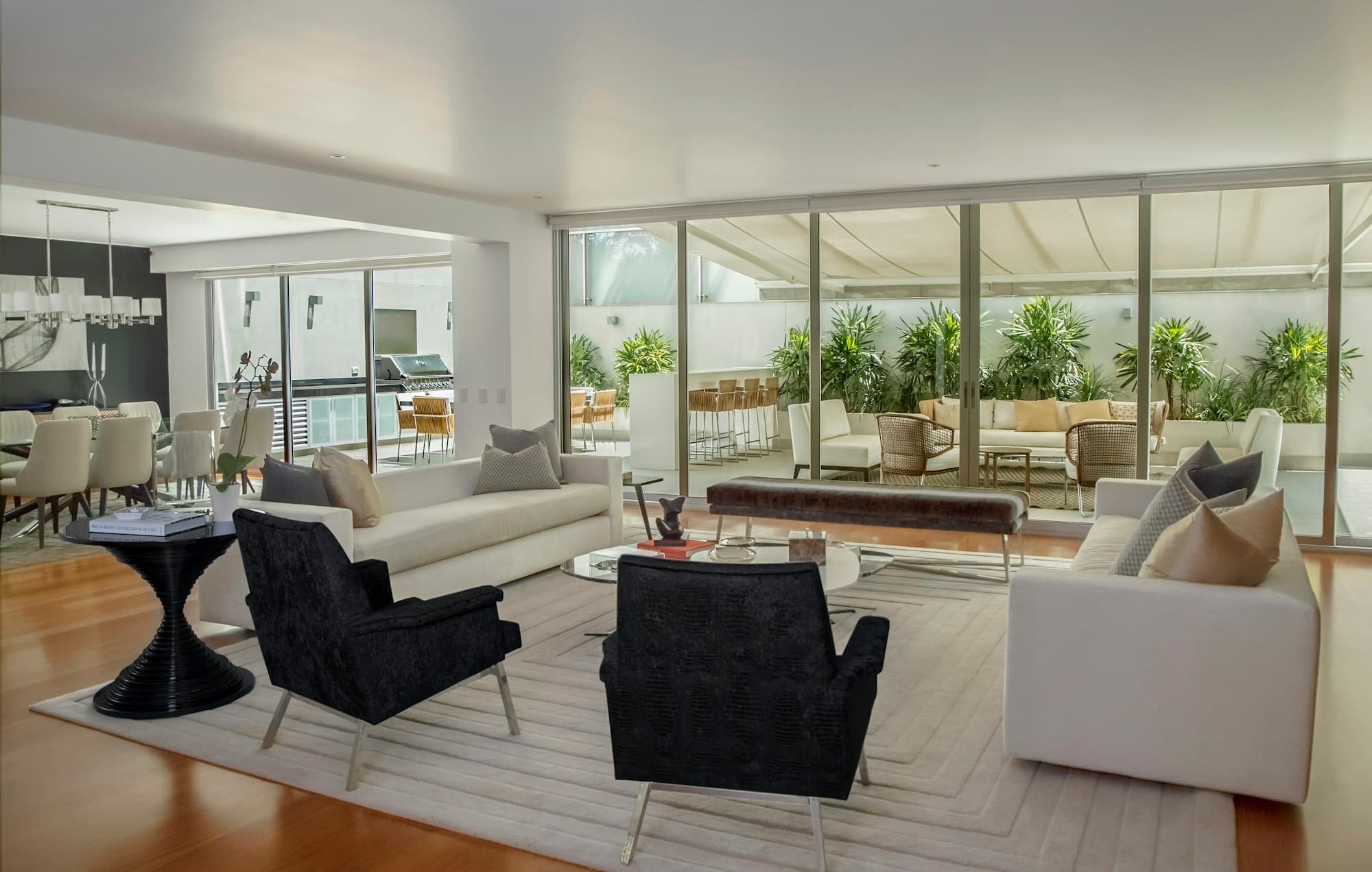
The most common cause of a room feeling wrong is not the room. It is a sofa sized for a different one. As a working guide, the main seating piece should occupy somewhere near two-thirds of the wall it sits against — enough to feel anchored, with breathing room at each end.
The same logic governs rugs, which should sit under the front legs of the seating at minimum, and coffee tables, which should be roughly two-thirds the length of the sofa. Undersized pieces make a room feel like a waiting area; oversized ones make it feel like storage.
Circulation is a dimension, not a leftover
Draw the routes people walk before placing furniture, not after. A primary route through a room needs around 900mm to feel unobstructed; a secondary route between a sofa and a coffee table can drop to 400 to 450mm. Below that, people start turning sideways, and a room where you turn sideways feels small no matter its area.
If a circulation route has to cut through a seating group, the arrangement is wrong. Rotating the furniture ninety degrees usually solves it.
Working in the vertical
Ratio applies to elevation as much as plan. Where a wall is divided — panelling, a dado, a change of material, the line where joinery stops — putting the division at half height is the one choice that reliably looks accidental. Somewhere near a third or two-thirds reads as intentional.
The same is true of hanging art and mirrors. Centring on the wall is rarely right; centring on the furniture below, at roughly eye level, almost always is.
Dividing a long room without building a wall
Open-plan living-dining spaces are the most common proportional problem we are handed. The room is a single volume at something like 1:2.4, which is uncomfortable as one space and produces two awkward ones if you simply split it in half.
The fix is almost never a partition. Zone the room instead using the things you were putting in it anyway — a rug defining the seating area, a change in ceiling treatment, a console or low storage run marking the boundary, and separate lighting circuits for each zone. Each zone can then be given comfortable proportions independently, while the room keeps the openness that made it desirable.
The test is whether each zone works with its back to something. Seating floating in the middle of a long room with no anchor behind it always feels provisional, however well proportioned it is on paper.
Doors, windows and the things you cannot move
A plan is constrained before you start drawing. Door positions dictate circulation, window positions dictate where furniture can go without blocking light, and the electrical and plumbing points dictate what a change would cost. Proportion has to be worked out inside those constraints rather than in the abstract.
This is the single biggest difference between a plan drawn on a blank rectangle and one drawn on a real flat. We mark every fixed element first — doors and their swings, windows, beams, service positions, the air-conditioning — and only then start placing anything. It is slower to begin and much faster overall, because it prevents the arrangement that works beautifully until you remember the door opens into it.
Testing a plan before you commit to it
A plan can be checked without any software. Walk it. Trace the route from the front door to the kitchen, from the bed to the bathroom at night, from the sofa to the balcony. Any route that requires squeezing past something is a route you will resent daily.
Then check the room empty of you: where does the eye land on entering? Every room benefits from having one thing worth looking at from the doorway, and plans that ignore this produce rooms that feel like they are missing something no amount of furniture fixes.
Only once a plan survives both tests is it worth modelling in 3D. Renders are persuasive and dimension-blind, and it is entirely possible to fall in love with a beautifully lit render of a room you would not enjoy standing in.
When to ignore all of this
Ratio is a tool for making decisions faster, not a standard to be met. A room that houses a piano, a wheelchair user, or a family that eats on the floor has requirements that override any proportional guide, and they should. Function wins every time it conflicts with proportion.
The rule is most useful when there is no functional reason to prefer one option over another — which, in practice, is most decisions in a plan. It stops those being made arbitrarily, and it is why two designers given the same brief and the same shell will produce plans that feel differently resolved.
How this shows up in our process
In our four phases, all of this lives in the 2D planning that happens before any 3D modelling. We test several plan options against use first and proportion second, and only once a layout survives both does it get built in 3D and rendered.
That order matters. A photo-real render of a badly proportioned room is a very persuasive way to approve a mistake, because renders sell atmosphere and hide dimension. The plan is where the room is actually designed.
Planning something similar?
We answer these questions on every project. Tell us about your space and we'll talk it through.